BikeRadar’s Slack channel sees plenty of outlandish cycling opinions proferred, backed up and – occasionally – dismissed.
When I chipped in with a cycling opinion earlier this year, it fell firmly in the ‘dismissed’ pile. Still, I want to put it on record formally: AG2R Citroën’s kit was the best in the pro peloton.
With the team becoming Decathlon AG2R La Mondiale for the 2024 season, and ditching its tasteful jersey design and brown shorts, I miss it already.
This claim was met with similar outrage as when it was revealed that BikeRadar’s senior videographer, Robyn Furtado, thinks cucumbers are the best cycling food. Liam Cahill, road and gravel presenter, said it was “possibly the most contentious take” he’d ever read.
However, I’m here to argue the haters are wrong and it’s 100 per cent fact.
Graphically (and thematically) strong
Before I began my career as a cycling journalist, I worked as a freelance design and arts writer, having completed a degree in design history.
While cycling wasn’t something I thought about directly in my studies, I was acutely aware of the implicit and explicit impact it had on art and design in the early 20th century.
The Bauhaus designer Marcel Breuer was so impressed by the strength and low weight of his steel bicycle that he decided to make, now ubiquitous, tubular steel chairs.
Marcel Duchamp’s Bicycle Wheel and Pablo Picasso's Bull's Head, made from a saddle and handlebar, are also suggestive of how cycling loomed in the collective imagination of the early twentieth century. Alfred Jarry’s satirical novel The Supermale has a chapter dedicated to a 10,000-mile bike race against a train, encapsulating Modernism's fascination with automation, speed and mobility.
These are instances of cycling being taken up by artists and designers, but come the 1980s, the art of the early 20th century was taken up by cycling.
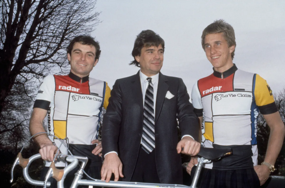
La Vie Claire had a now instantly recognisable kit influenced by De Stijl, an art movement based on strict vertical and horizontal geometry and bold, block colours. The 1985 La Vie Claire kit is one of the most recognisable in the sport’s history, and in my eyes, the AG2R Citroën kit is a direct descendant.
The reason for this is the AG2R Citroën kit follows principles of Swiss Design, which itself was influenced by the simplicity and grids of De Stijl.
Stripping away embellishment by using sans serif over serif fonts and focusing on grid patterns, Swiss Style aimed to present information clearly and in a straightforward manner.
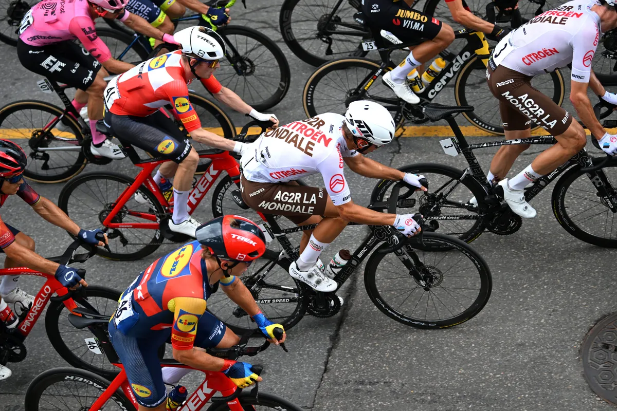
This was reflected in AG2R Citroën’s old kit: it’s instantly recognisable – and legible – as the peloton sweeps along the road at races such as the Tour de France.
The kit was, in short, graphically strong. But the fact the design arguably has a tie to the La Vie Claire kit and that AG2R Citroën rode BMC bikes, from Switzerland, while wearing this Swiss Style kit made it thematically strong, too.
It was a deeply satisfying combination for design nerds like me.
No gimmicks here
Like many minimalist designs, the simplicity of AG2R Citroën’s kit is deceiving. Look closely and it’s not straightforward at all.
The angle of AG2R Citroën across the back brings dynamism to an otherwise clean design. It also means that when helicopter images are relayed to your TV set, with the peloton travelling from left to right, you can read the text without twisting your head. Stunning.
Look again and you’ll see the ‘R’ of AG2R and the ‘R’ of Citroën are not the same. How satisfying once you spot this.
Again, the combination of black, red and white is so simple, so classic – enough for The White Stripes (whose second album was called De Stijl) to create a whole visual identity around for 13 years. But, it isn’t black, red and white: it’s brown, red and white. That’s another detail that makes this kit so much more enjoyable the more you look at it.
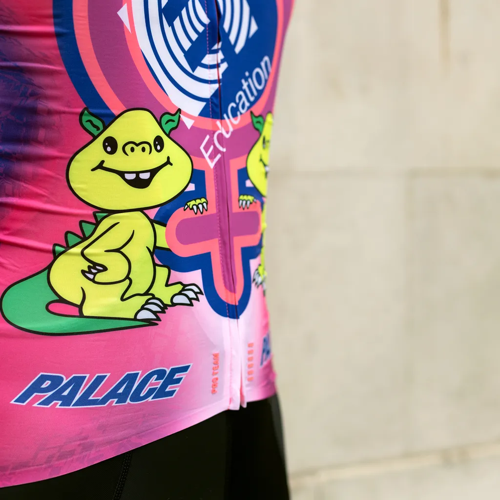
In other words, the kit flew in the face of what we’ve come to expect from the latest headline-grabbing designs, where teams and brands rely on gimmicks such as possessed ducks and little green dragons.
My bet is the trend for over-the-top, gimmicky kits of recent years has been an unstated but brash rebuttal of the bland blues and blacks that came to dominate the professional peloton, with the likes of Team Sky.
I’ve written before about how brands have co-opted alternative cultures to make cycling more appealing and to stand out against the monkish, dull face of road cycling. But the AG2R Citroën kit shows how employing classic design principles can offer the greatest rebuttal of all.
Goodbye gatekeepers
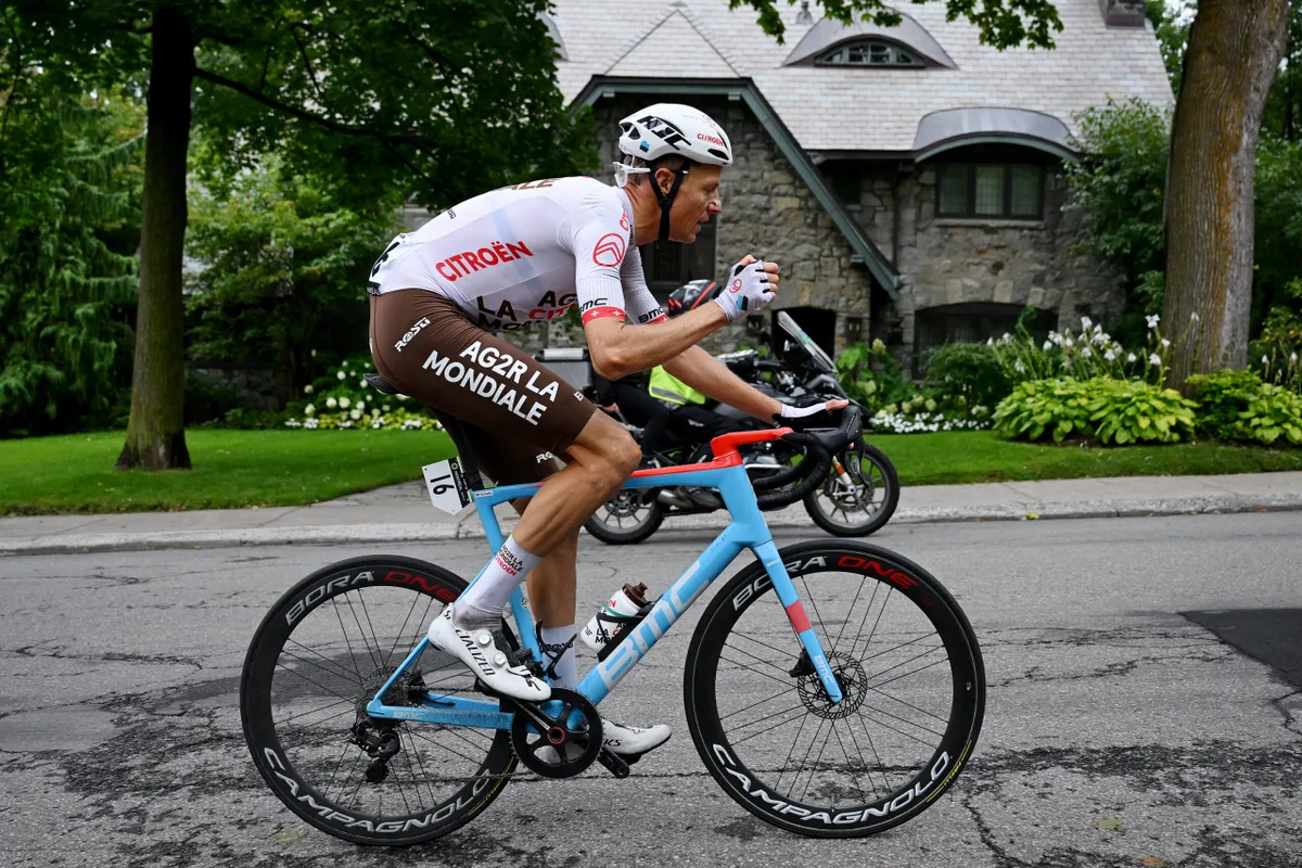
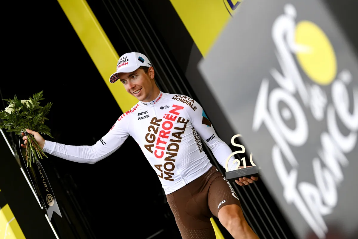
Of course, no defence of the AG2R Citroën kit would be complete without addressing the brown bib shorts. Discussion of these shorts was what led to my proclamation on Slack, the messaging platform, in the first place. These have now been dropped, with the team wearing boringly typical black shorts – and it’s a true shame.
The brown shorts revealed something about road cycling, which should really be banished: its gatekeeping.
The style conventions of road cycling make an already exclusionary sport – with its increasingly high price of entry and lack of diversity – harder to take part in: your handlebar tape has to match your saddle; you have to wear tall socks, or risk being chastised (“What are you? A triathlete?”); black wall tyres are better than tan (or vice versa); your bib shorts have to be black.
AG2R Citroën’s brown shorts were a reminder that cycling doesn’t have to be like this. And when paired with the deceptively simple jersey design? Well, that’s just gorgeous.